The Art of the Sign

3 minute read

Ever since smartphone cameras became commonplace and you could quickly and conveniently grab a picture of anything anywhere, I’ve been taking pictures of unusual or interesting signs I come across.

I find signs fascinating from a design perspective. Sometimes you hear people cynically say that if you see a sign telling you not to do something, it means somebody did that thing. This probably isn’t quite true, but signs usually are placed to solve some kind of problem, whether it’s occurred in the past or only in someone’s overactive imagination, and it’s fun and instructive to try to identify what that problem is.

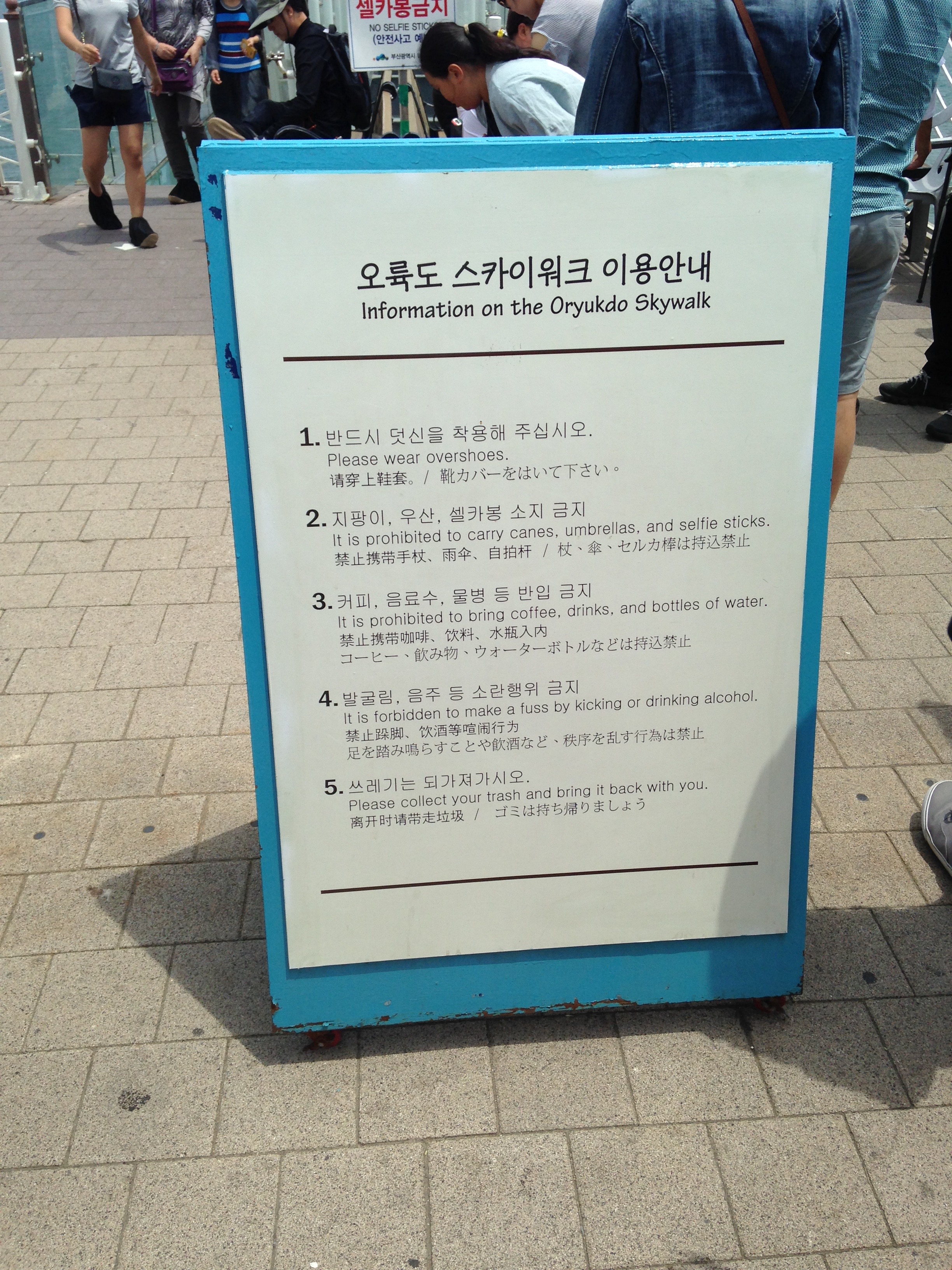
Sometimes it’s pretty straightforward. For instance, there’s the long list of specific things you can’t do:

A sign on a blue easel in English, Korean, and several other Asian scripts. The English reads as follows: Information on the Oryukdo Skywalk / 1. Please wear overshoes. / 2. It is prohibited to carry canes, umbrellas, and selfie sticks. / 3. It is prohibited to bring coffee, drinks, and bottles of water. / 4. It is forbidden to make a fuss by kicking or drinking alcohol. /  5. Please collect your trash and bring it back with you.

(My favorite is, “It is forbidden to make a fuss by kicking or drinking alcohol.” At least in the English version, both are apparently fine as long as you don’t make a fuss, as is arriving already drunk, or kicking without making a fuss.)

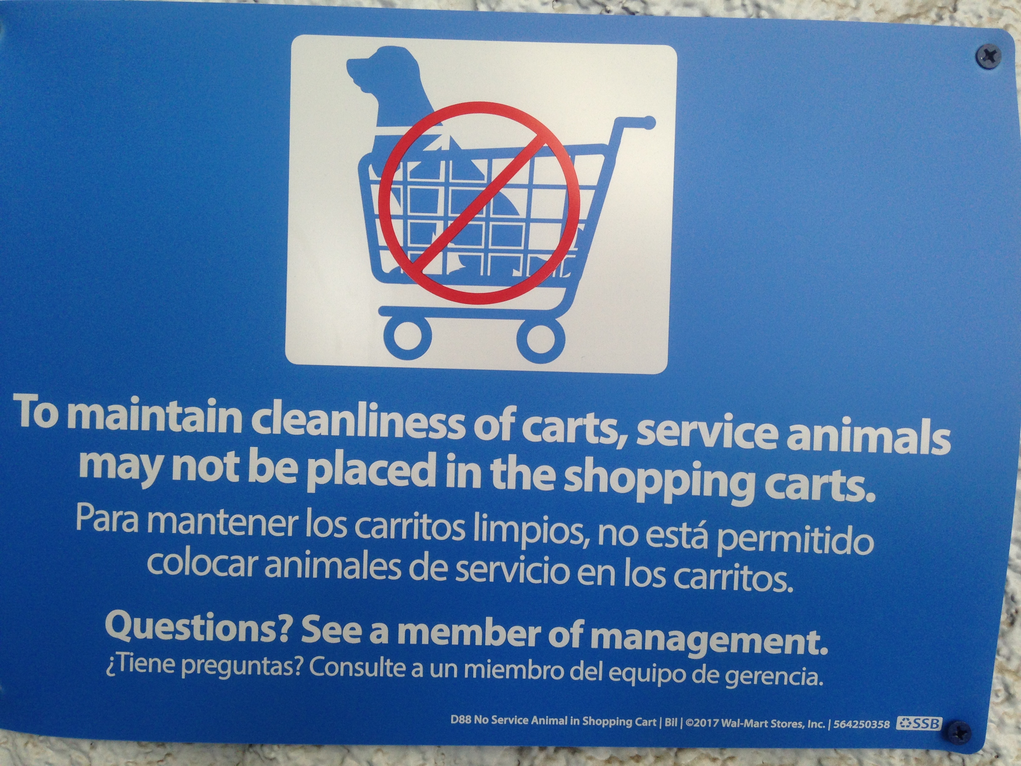
These get much funnier when they call out a specific behavior, like this sign Wal-Mart started posting recently:

A line illustration of a dog sitting in a shopping cart facing forward, with the red “no” symbol over it. Beneath the subtext in English and Spanish reads: To maintain cleanliness of carts, service animals may not be placed in the shopping carts. / Questions? See a member of management.

They get weirder. I spotted this one outside a motel in Minnesota. Who the heck makes these prefabricated “no-dog-peeing” signs?! If I can find out, maybe I should get one for my yard.

A small red sign stuck in the ground by some landscaping, bearing a picture of a dog peeing with the red “no” symbol over it.

And other times they get so specific you start to wonder if anyone will ever actually try to do that thing again (I’m quite confident this one is a manifestation of “someone did that”):

A word-processed sign with the AmericInn logo and the slogan “Welcome to the end of the day.” in the upper-left, kept in a sheet protector and Scotch-taped to the wall. The main text of the sign reads: Please DO NOT heat hard boiled eggs in the microwave. They will explode. The words “DO NOT” are in red, bold, and underlined, and “They will explode” is in bold.

Also: Don’t stuff beans up your nose.


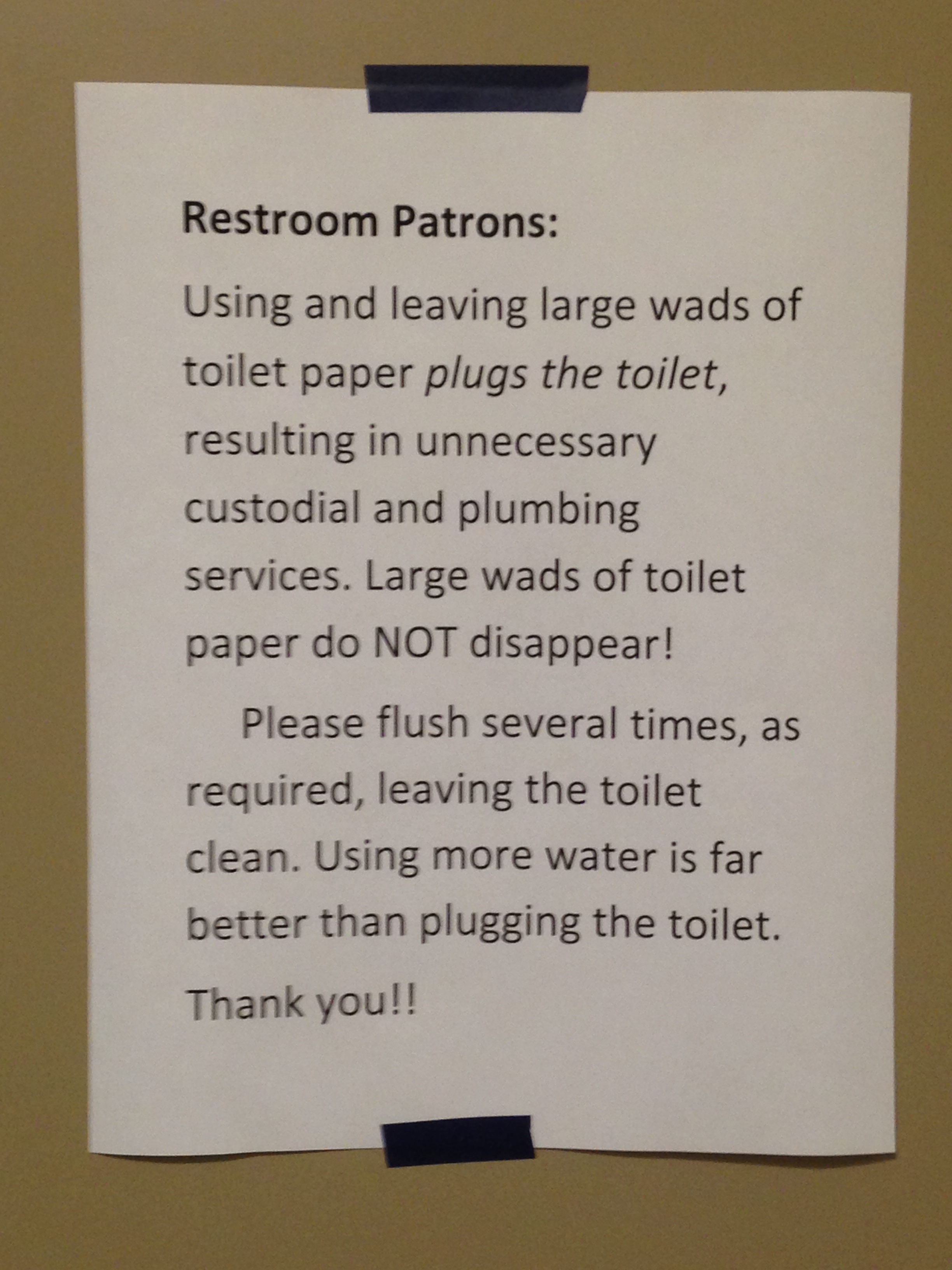
But sometimes they point out that something’s been designed poorly, and this is where they get really interesting. The sign is being used in a last-ditch attempt to cover over the design problem (with limited success, because as everyone who’s worked in any service industry knows, people rarely read signs). Starting to identify these kinds of signs is great practice for spotting small problems you might be able to actually fix instead of just papering over. For instance, this one draws attention to the fact that some combination of the toilet and toilet paper evidently flushes especially poorly:

A sign affixed with electric tape, reading: Restroom Patrons: / Using and leaving large wads of toilet paper *plugs the toilet*, resulting in unnecessary custodial and plumbing services. Large wads of toilet paper do NOT disappear! / Please flush several times, as required, leaving the toilet clean. Using more water is far better than plugging the toilet. / Thank you!!

These boxes probably shouldn’t just be sitting in a public place on a table:

A handwritten sign in chisel-point Sharpie on pink construction paper, reading “Do Not Take Boxes”, affixed to a cinder-block wall above a table bearing several sets of ten new, flattened cardboard boxes still zip-tied together.

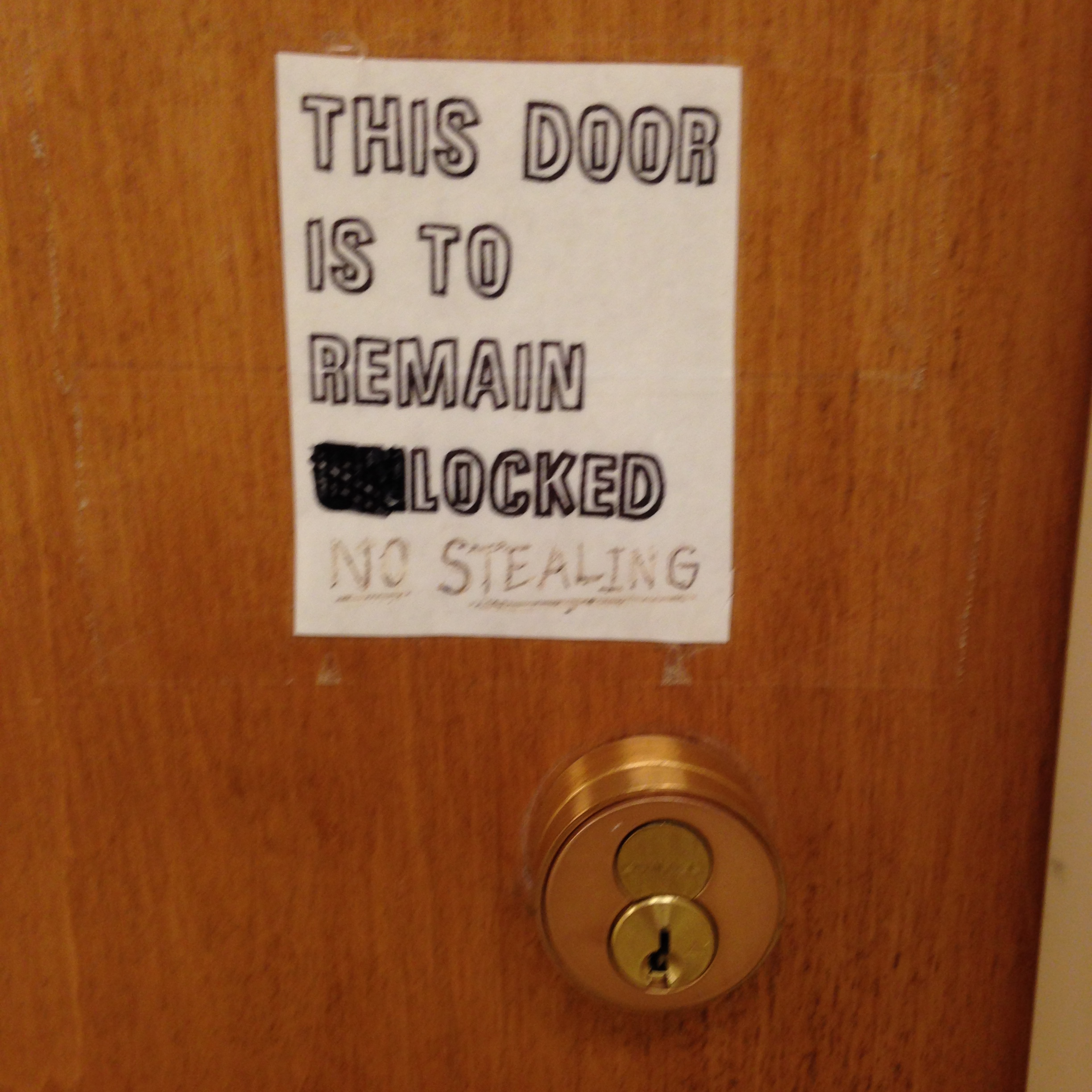
Here it seems nobody can decide on how the door should be used (they should figure that out first!), but once they do, an automatic lock or no lock should likely be used:

A deadbolt cylinder on the right side of a door, with a sign above it reading in all-caps stenciled letters, “This Door Is To Remain Unlocked.” The “UN” in “Unlocked” has been blacked out with a marker, and underneath someone has written in underlined text in a marker that didn’t apply to the surface well, “No Stealing.”

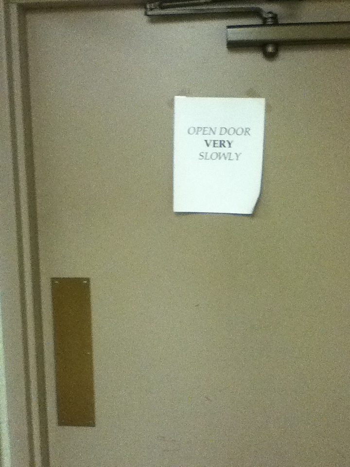
This door was installed without a window in a place where you can’t stay out of the way of the door while approaching it:

A sloppily word-processed sign crookedly hung with Scotch tape on the inside of a gray metal door which can be pushed open without using a knob reads “OPEN DOOR *VERY* SLOWLY”.

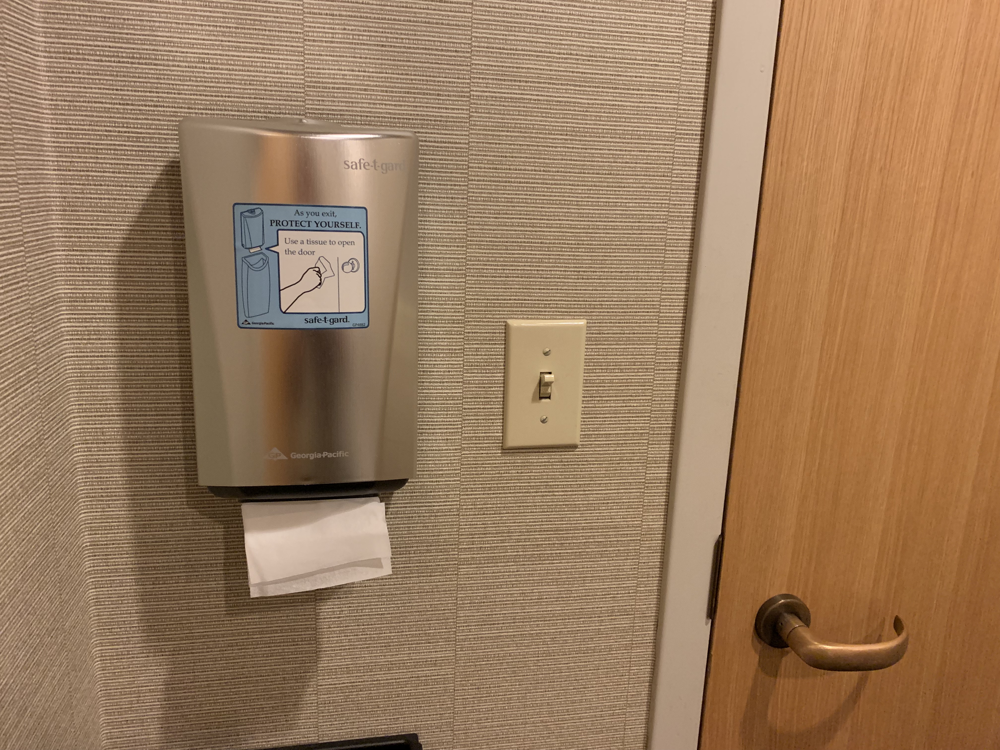
And one of my recent favorites was this entire device – with a complicated sign explaining its use. The need for this whole dumb device and all of the disposable paper it dispenses could have been eliminated by the simple expedient of having the restroom door swing the other way so you could open it with your shoulder. To add insult to injury, the space inside the door was so small you practically had to lean against the wall to open it, and there’s no way someone with a wheelchair or other mobility device could have managed.

On the right side of the picture, a door with door handle opening inwards. On the left side, a light switch, and to its left a small paper-towel dispenser of sorts dispensing single tissues from the bottom, with the outline of a trash can in the picture below. A sign on the dispenser reads: “As you exit, PROTECT YOURSELF. Use a tissue to open the door.” The second sentence is shown inside a speech bubble emanating from a picture of the dispenser. Fortunately, the picture of the dispenser on the dispenser does not contain a picture of the dispenser to prevent infinite regress.

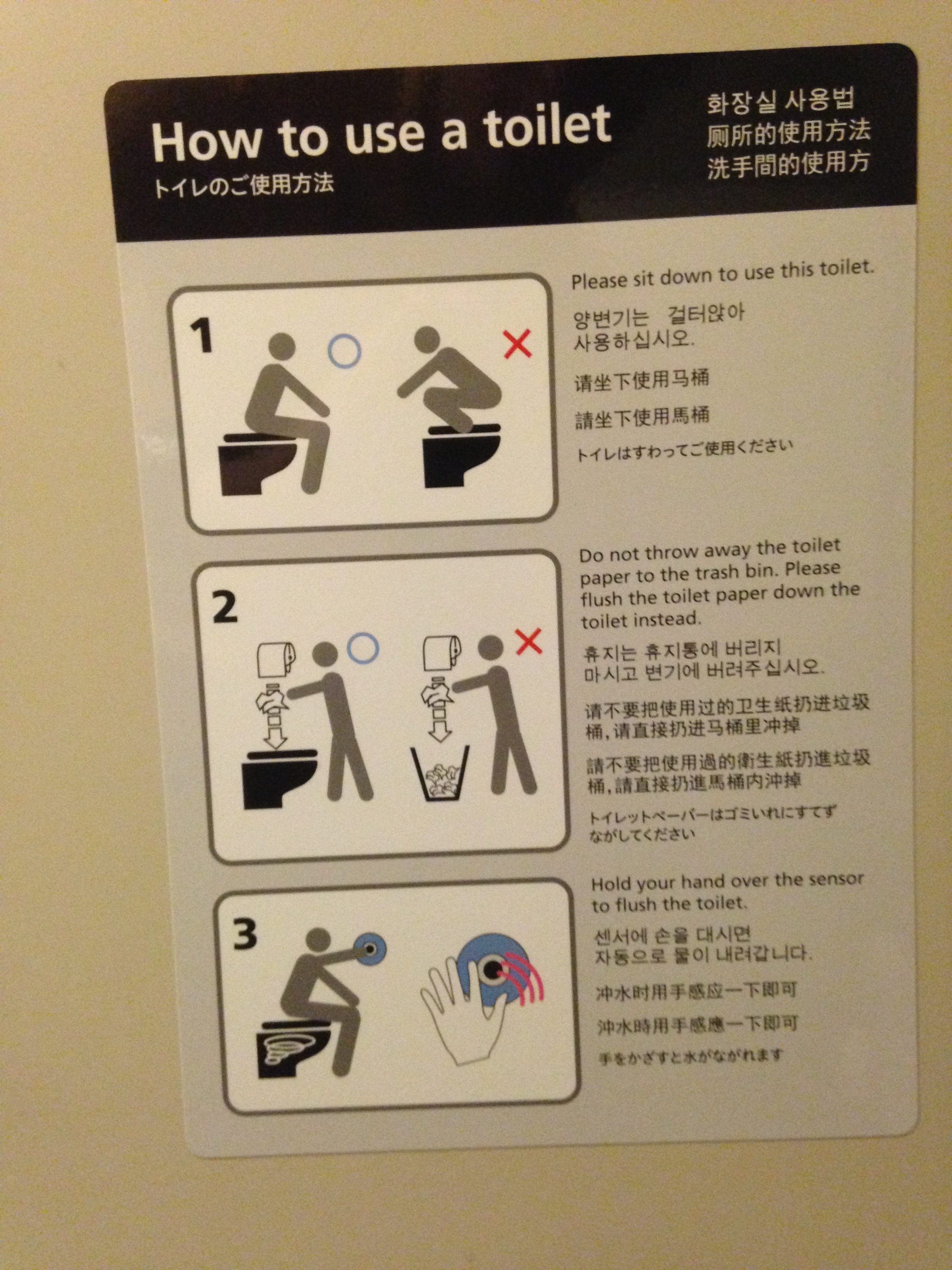
I’ll leave you with “How to Use a Toilet,” an informational display on the Shinkansen bullet trains in Japan. It teaches a great deal about cultural differences in toilet use in Asia.
Three annotated pictures under the heading “How to use a toilet”, annotated in English, Korean, Japanese, and several more. Picture 1: An “OK” (blue circle) picture of a person sitting on a toilet, next to a “bad” (red X) picture of a person squatting on a toilet facing the wall. The English text reads “Please sit down to use this toilet.” Picture 2: An “OK” picture of a person taking toilet paper from a roll above the toilet and placing it in the toilet, and a “bad” picture of a person taking toilet paper from a roll above a trash can and placing it in the trash can. The text reads “Do not throw away the toilet paper to the trash bin. Please flush the toilet paper down the toilet instead.” Picture 3: A person places their hand over a blue circular target on the wall, with waves emanating from it, and the toilet shows circles indicating flushing. The text reads “Hold your hand over the sensor to flush the toilet.”