Likable Software
Software defines a substantial portion of the landscape of modern life. The quality of software can make or break a project or our ability to enjoy a task or an entire job. I wrote about the difficulty of creating good software in Likable Software. On this page, I collect examples of likable software – software that doesn’t just work well but actively makes me happy when I use it because it’s so effective and well-designed.
I consider both open-source and commercial software and both webapps/Software as a Service and desktop/mobile apps. Open-source desktop applications have an advantage since I believe these models are the best for user freedom and efficiency, but software that does other models well deserves recognition too. The list is necessarily incomplete, but I will continue to update it as I encounter new contenders.
This page is organized by broad categories of tasks that we use software for.
I have not received and will not accept any form of compensation for promoting any of these tools. They’re all things I legitimately love.
Organization
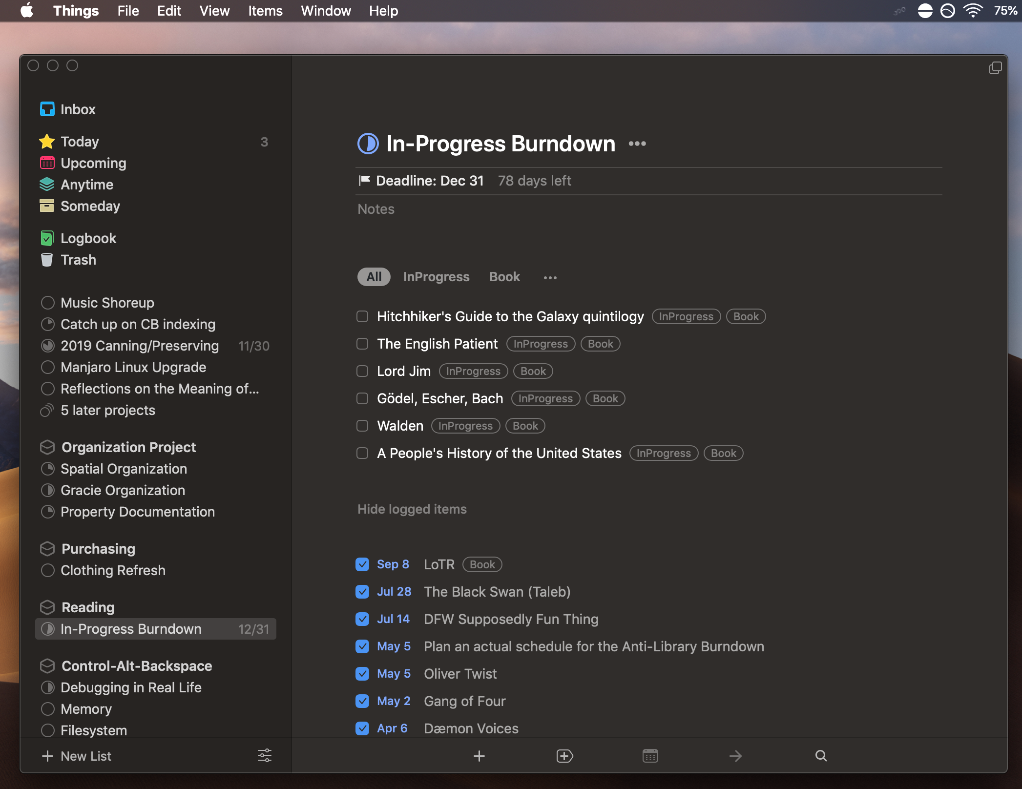
Things
Things is a fabulous task management tool. It has won not one but three Apple awards (two Design Awards and one Editor’s Choice Award). If you know anything about these awards, earning one is difficult enough! Aside from a good user interface and general usability, it does several other things right:
- It is moderately opinionated – the design gives you strong cues about the best way to use it, and it prioritizes simplicity over letting you customize everything, but it also doesn’t get in the way of most workflows you might want to institute. And the type of workflow its design pushes you towards is an excellent one that has helped many people organize their lives.
- It is extremely responsive, and it auto-syncs in the background between devices so fast that if I make changes on my phone with my MacBook in front of me, my changes are often reflected on the laptop before I even look up at the screen! Performance is often neglected nowadays, but an application that responds as fast as you can see the change is noticeably more pleasant to use than one that exhibits even a short lag. (This is one of the reasons I dislike the trend toward webapps that run only in browsers.)
- There are useful keyboard shortcuts for nearly everything, and for the most part they are memorable and easy to type. There are a few bad choices and odd omissions, but then nothing can be perfect.
Unfortunately, Things is only available for Mac and iPhone, and it’s not open-source. Boo. Still, if you’re invested in the Apple ecosystem, $60 for the Mac and iPhone apps is an easy sell. Now that I’ve been using Things for some months, I would consider paying $600 for it if that’s what it took – it’s that good.
Things doesn’t have a great export function, but it does let you copy and paste to-do items to a text file, and its data is stored in a standard SQLite database, so lock-in isn’t a major issue even though it’s not open-source. There is also AppleScript support.
Simplenote
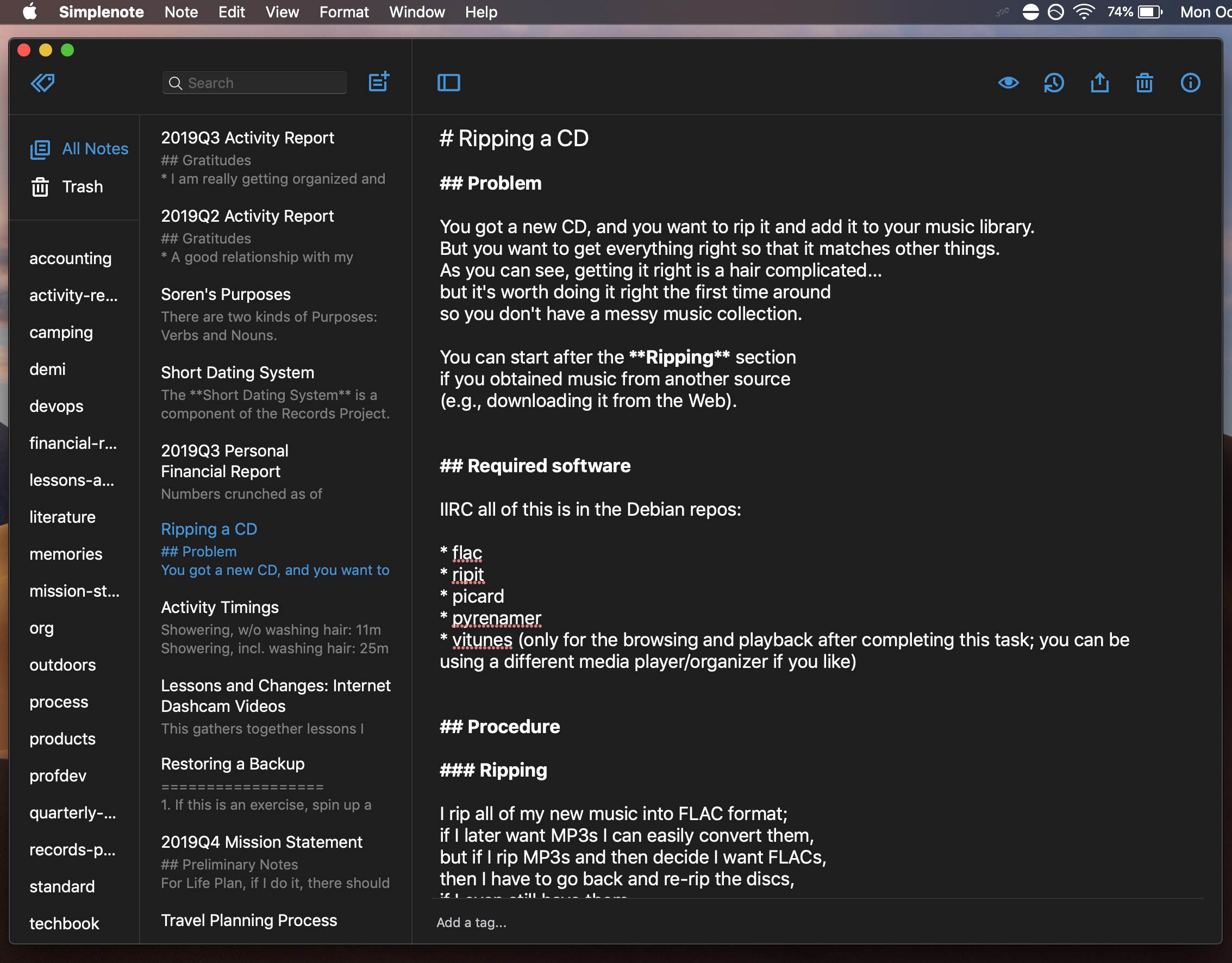
Simplenote comprises a web service and several associated apps that sync your text notes between devices. You can access it on computers, on phones, in web browsers, and through an API that works with many third-party applications.
Simplenote’s strength is right there in its name: it’s really simple! You type plain text with no formatting into notes; you can use Markdown as well (Markdown gets an award too; see below). You can organize notes with tags. You can go back in time to previous versions of your notes. Your changes sync between devices. And that’s basically everything you can do in Simplenote. There are no images, no links between notes, no collaboration, no colored text, no digitizing paper notes, no font selections, no anything else that you might imagine a note-taking app would do. But you know what? A lot of times you don’t need any of that stuff, and it just gets in your way. Simplenote does one thing, and it does that one thing just about perfectly (this is the Unix philosophy mentioned in the original Likable Software article at work).
One common property of likable software is that it just works, and Simplenote gets this title too. With such a restricted feature set, there’s nothing to not work, and if you can’t figure out how to use it after poking around for a few minutes, you have probably never touched a computer. Because plain text takes up so little storage space and bandwidth, it’s so cheap to host that it’s totally free – and I mean really free, not just “no charges show up on your bank statement” like most free services nowadays. There are no advertisements, no automated scanning of your content, no limits on how many notes you can have, no premium version to get nagged about. My guess is that Automattic runs it to draw attention to their other products – because it’s so cheap and so simple to maintain that it’s not much of a burden.
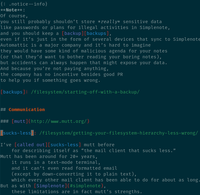
Note: Of course, you still probably shouldn’t store really sensitive data like passwords or plans for illegal activities in Simplenote, and you should keep a backup, even if it’s just in the form of several devices that sync to Simplenote. Automattic is a major company and it’s hard to imagine they would have some kind of malicious agenda for your notes (or that they’d want to bother reading your boring notes), but accidents can always happen that might expose your data. And because you’re not paying anything, the company has no incentive besides good PR to help you if something goes wrong.
TiddlyWiki
TiddlyWiki describes itself as “a non-linear personal web notebook.” It’s a single HTML file you can download that acts as a personal wiki. Even cooler, it’s a complete self-referential software platform that’s highly customizable – the wiki itself is written in wikitext using primitives like dynamic lists and transclusions, so once you learn how those things work, you can change almost anything within TiddlyWiki as well. This means you can use TiddlyWiki’s language to create custom applications which evolve along with your data, a key component of likable software. You don’t have to leave the system to write new software, you just make tweaks whenever they’re necessary.
The more you know about computers, the more you’ll be able to do with TiddlyWiki, but you don’t have to be a professional programmer to make it do all manner of cool things. I’ve written a free, donation-supported textbook, Grok TiddlyWiki, to teach you how.
I use TiddlyWiki for many things, notably my Zettelkasten, a repository of notes and ideas that aren’t fully developed into essays or books but might still be useful to somebody.
Communication
mutt
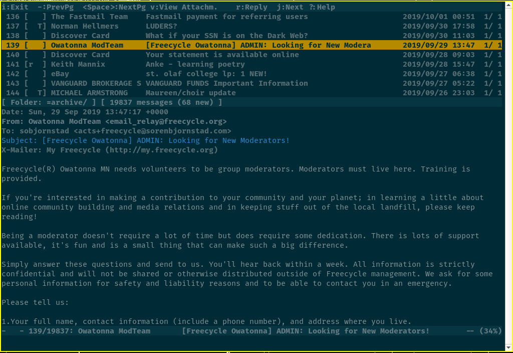
I’ve called out mutt before for describing itself as “the mail client that sucks less.” Mutt has been around for 20+ years, it runs in a text-mode terminal, and it can’t even read formatted email (except by down-converting it to plain text), which every other mail client has been able to do for about as long. But as with Simplenote, these limitations are in fact mutt’s strengths. When all you want to do is read some email and move on with your day, HTML email can impede readability and even exploit security vulnerabilities to install malware; graphical interfaces and webmail are much slower than mutt; and a keyboard-and-terminal interface can be more efficient and integrate better with other tools than a more “modern” interface.
Mutt starts and shows my inbox in under a quarter of a second, compared to at least several seconds to load Gmail or similar tools, and it can load my entire email archive of nearly 20,000 emails in about a second (Gmail loads 100 messages at a time and takes a second to do that). When I send email, I can write it in whatever text editor I like, like vim. Mutt’s searching and filtering features are better than that of any other tool I’ve ever used.
The major disadvantage of mutt is that it’s hard to learn. The default configuration isn’t very good, so you have to spend a couple of hours poring over resources on the web and typing arcane configuration commands into a text file. That said, most of us spend at least a couple percent of our waking hours working with email, so anything that can make email more pleasant is probably worth a bit of initial pain!
FastMail
I’m not a fan of free email services. Don’t get me wrong, they’re great if you don’t care much about maintaining control over your email and don’t mind Google or some other Big Tech company scanning it and using it to target advertisements. If you mostly use email to sign up for other services and don’t have any important information there, Gmail might be a great fit for you. But for many of us, email is an indispensable tool and losing access to an email account would be a catastrophe. If you ever experience problems with Gmail, Google is rarely helpful. I heard a horror story some years back in which someone got banned from some random Google service and thus also lost access to all their email in Gmail – permanently!
Paid email services can be very affordable (I pay $3 per month at FastMail – that’s equivalent to the cost of driving about 5 miles at the current IRS mileage rate). In return, you get a support contact who has a reason to care about you; no advertisements, upsells, or nonsense; the ability to move your email to a new provider without changing your address if you get fed up; and often moderately better privacy (FastMail is by no means perfect, but they’re an Australian company so they have more protections against US government surveillance than a US company like Gmail would, and they make privacy a priority).
FastMail does all the things you want from a paid email service. Its webmail interface is much cleaner and easier to use than Gmail’s or Microsoft’s or Yahoo’s in my opinion, and it easily integrates with any other email program you might want to use (see mutt). Additionally, as the name suggests, FastMail is blazingly fast. I didn’t realize how slow Gmail was until I started using FastMail, but Gmail feels intolerably laggy to me now. FastMail also has great support for filtering and customizing your email workflow.
In short, FastMail doesn’t have any killer features, but it eliminates almost all of the minor technical annoyances and risks of working with email, which is uncommon enough to make it likable! Then you just have to deal with the content of the email, which unfortunately isn’t so easy to control…
Markdown
Markdown is a way to format simple documents and notes that’s easy to write (using only the buttons on your keyboard), easy to read even without rendering, and easy to convert to HTML, the formatting language used for web pages.
Here are some things Markdown does right:
- The syntax is intuitive; you probably already know it! If you only had a typewriter or Windows Notepad and you had a lot of notes to type up and format, you’d likely come up with conventions quite similar to Markdown. For instance, to italicize some text, you put asterisks on either side of it (like *this*), and to create a section, you underline its title with a row of equals signs. Even if you see only the text and not the web-page output, Markdown is already clean and easy to read.
- The syntax covers everything you need to create basic documents, and it doesn’t include anything else, which keeps it easy to learn.
- If you do need some complex formatting feature, you can embed HTML directly in your Markdown, so you aren’t limited if you do need those features.
- You can use any software you like to edit Markdown files. And many popular websites like Stack Exchange and Reddit now use Markdown to format comments. Once you know Markdown, if a tool says the magic words “Markdown formatting” next to a text box, you instantly know how to use it! Too much time nowadays is wasted relearning how to do basic things like format text across slightly different software applications.
The biggest weakness of Markdown today is that there are probably five or more dialects of Markdown in common use, each with slight idiosyncracies. A standardization effort is underway, but until then you may have to guess how to do less common tasks like creating tables or code blocks, and some dialects don’t support these features at all.
Note: If you want to get technical, Markdown isn’t strictly software, it’s a specification for a language that has many different software implementations (thus the issue with multiple dialects). Nevertheless, Markdown is a tool we can use to perform daily tasks, which means it serves the same role as software in our lives, and I believe that means it deserves a place on this list.
vim
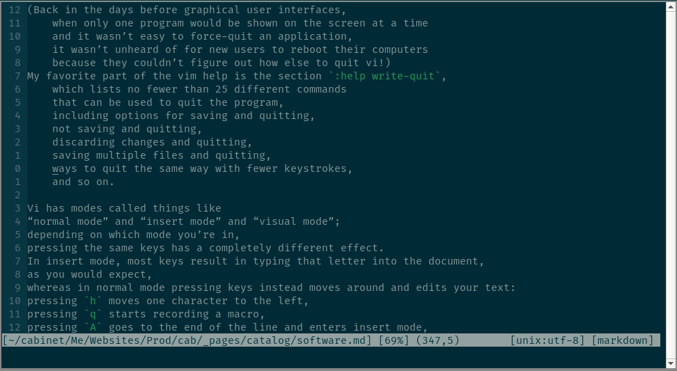
Vim is the most popular modern version of the original vi text editor
written for Unix systems in 1976,
and it’s still popular today among technical users.
The interface is often blamed for being confusing and unintuitive,
and really, what else can you say about an editor
where you type gqip to re-flow a paragraph of text,
or :wq to save and quit?
(Back in the days before graphical user interfaces,
when only one program would be shown on the screen at a time
and it wasn’t easy to force-quit an application,
it wasn’t unheard of for new users to reboot their computers
because they couldn’t figure out how else to quit vi!)
My favorite part of the vim help is the section :help write-quit,
which lists no fewer than 25 different commands
that can be used to quit the program,
including options for saving and quitting,
not saving and quitting,
discarding changes and quitting,
saving multiple files and quitting,
ways to quit the same way with fewer keystrokes,
and so on.
Vi has modes called things like
“normal mode” and “insert mode” and “visual mode”;
depending on which mode you’re in,
pressing the same keys has a completely different effect.
In insert mode, most keys result in typing that letter into the document,
as you would expect,
whereas in normal mode pressing keys instead moves around and edits your text:
pressing h moves one character to the left,
pressing q starts recording a macro,
pressing A goes to the end of the line and enters insert mode,
pressing gg moves the cursor to the start of the document.
But then you can start doing wicked-cool things.
Typing c4w deletes the next four words and drops you into insert mode.
Typing ysis) puts parentheses around the current sentence.
Typing d/test deletes everything between the cursor and the word test.
Typing 2. deletes the same thing again,
up until not the next test but the one after that.
The commands may seem cryptic,
but they’re actually quite mnemonic,
and you can mix and match parts of them.
ysis) for instance is read:
ys, “you surround” – put matching brackets or braces or quotation marks around something;is, “in sentence” – the sentence the cursor is over, minus the spaces at the start and end of it;), the type of bracket you want to surround with.
If I wanted quotation marks or square brackets,
I’d just type that character instead of ).
If I wanted to surround a paragraph,
I’d type ip instead of is.
If I wanted to indent the sentence instead of surrounding it,
I’d type > instead of ys.
This is not to say vi is easy to learn – it’s not – but if you spend a lot of time writing and/or editing code, like I do, it’s not that hard either. Spend a few hours over the course of a month or two and editing text becomes way easier. Being able to use every key on the keyboard to perform operations on text in normal mode means you can keep your hands on the normal keys instead of reaching for the arrows and the mouse all the time. The editing language where you can combine counts, semantic notions like “sentences” and “paragraphs” and “the stuff in these braces”, and operations like “delete” or “change” or “surround the text” or “count the words” does wonders for productivity and fluency.
Detractors of systems like vi often focus on speed. Surely it’s not that much faster to type funky letters instead of just pointing at the screen with a mouse, is it? I’ve never done a timing study, but I’d guess it isn’t; but that actually isn’t the point. The real benefit is fluency: counting taps of the arrow keys, reaching for your mouse and trying to point at exactly the right spot, and trying to spot some text you know is on the screen – all common features of standard editing – are really distracting! With Vim, once you’ve learned the keystrokes, you can instruct the computer to do what you’re thinking on a high level, like “delete the sentence I’m working on” or “move down 8 lines”, instead of having to translate that into a bunch of button taps or hand-eye coordination. That leaves your brain in a deep flow state so you can focus on what you’re actually trying to write instead of how to make it show up on the screen. If you think you’re fluent with a standard mouse-and-arrow-keys-based editor – many people do – all I can say is you don’t know what you’re missing. After years of Vim combined with touch-typing practice, I don’t even think about the fact that I’m typing or using a computer anymore. It’s more like having a gigantic chalkboard where I can instantly write things and move things around by pointing. Using the standard interface feels like using a chisel-tip Sharpie held in my fist to do technical drawing.
Could someone designing a new editor do a better job than vi? Absolutely; a lot of the precise choices of letters and keybindings don’t make a whole lot of sense, and even Bill Joy who originally wrote it isn’t entirely satisfied. That said, vi keybindings are now burned into the fingertips of hundreds of thousands of people and available in many, many programs for power users, and after 44 years they’ve proven to be quite good enough.
See also Why do those nutheads use vi?
Miscellaneous
Parallels
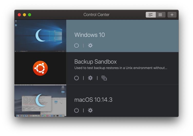
Virtual machines (usually just called VMs) are incredibly useful if you spend a lot of time messing with computers. As the name suggests, they let you create a computer entirely in software – so I can have three different “computers” running at the same time on one physical machine, for instance. That might not sound too useful at first blush, but it lets me do some pretty nifty stuff, like backing up a complete work environment and copying it to a coworker’s machine so they don’t have to install anything to pick up with your work, testing out malware to see what it does without risking compromise or damage to the actual computer, or running Mac, Windows, and Linux applications at the same time on the same desktop. (They’re also indispensable for modern “cloud” server architecture.)
The trick is that VMs have historically been a real pain to set up. Large organizations have tools to make managing VMs easy, but for an average end user, installing a VM has been pretty much like installing an operating system on the physical computer, and if you’ve ever done that, you know how long it takes and how many things there are to go wrong! Parallels, on the other hand, makes creating a new VM a matter of a couple of clicks, and maintenance beyond that is just as easy. If you have to buy a license for the operating system, you can do that right from the app. Pretty much everything you could need is covered in a straightforward, intuitive way.
Parallels is another unfortunately-Mac-only tool, and it has a moderate yearly subscription fee of around $100 depending on what version you get, but it’s likable enough I am happy to pay for it even though I have the experience needed to do all the work manually for free and I don’t even use VMs that much! Life’s too short to spend it configuring VMs.
Photo Transfer App
Here’s an example of an app that shouldn’t need to exist, but it does, and it fills an important gap excellently. It’s an enormous pain to move pictures from an iOS device to another device. If there are only a couple, you can email them; if the other device is also an iOS device, you can use AirDrop; and if iCloud is an OK source, the pictures are already there. But if none of those apply, you will be tearing your hair out trying to get the pictures across. I don’t use Android, but I understand similar issues can apply there as well.
In comes the aptly named Photo Transfer App, which offers a wide variety of source and target devices. Grab the app on all your devices (or even grab it on one and then connect via your web browser on the others), pick an option, and your photos will be moved in no time.
The Photo Transfer App does one small thing very, very well. It doesn’t try to get complicated or cute, and most importantly, it just works.
On many devices, this app is free; on others it’s a couple bucks. The app works with Windows, Mac, Linux, Android, and iOS, as well as a number of cloud storage services. I guarantee you’ll come out ahead paying for this app even if you value your time at minimum wage.
